A concrete dining table can change the whole feel of a room before you have added a single chair. That is why concrete dining table colours matter so much. The right shade does more than match a kitchen – it sets the mood of the space, picks up the architecture around it and decides whether your table feels quiet and refined or bold enough to become the natural centrepiece.
Unlike painted furniture, polished concrete has depth. It is not a flat block of colour applied on top. The tone sits within the material, shaped by the mix, the finish and the hand-finishing process. That gives concrete its character, but it also means choosing a colour is less about picking from a standard chart and more about understanding how the table will live in your home.
Why concrete dining table colours look different to other materials
Timber has grain. Marble has veining. Concrete has movement of its own. Even within a single colour family, you will see tonal variation, soft mottling and subtle changes across the surface. That is part of the appeal. A polished concrete dining table feels architectural and clean-lined, but never sterile.
This matters when you are planning a dining space in an open-plan kitchen or a renovated family home. A colour that looks simple in isolation can feel quite different once it sits beside cabinetry, flooring, brassware and natural light. Pale concrete can read warm and chalky in one room, then cooler and sharper in another. Darker finishes can feel dramatic and grounding, but in a room with limited daylight they may also feel heavier than expected.
That is why colour choice should never be rushed. With a bespoke table, the tone is part of the design, not an afterthought.
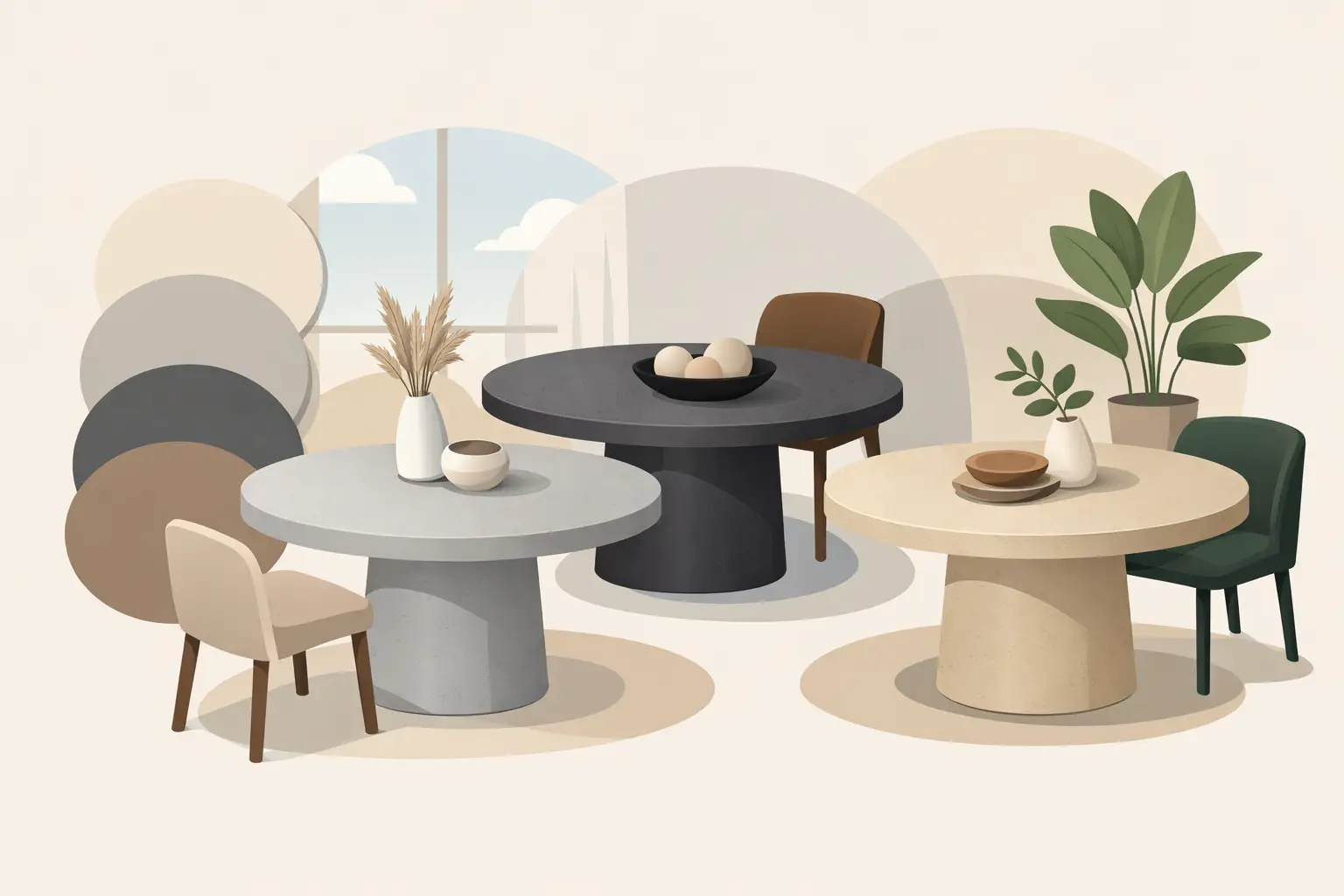
The most popular concrete dining table colours
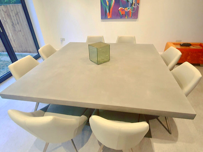
Grey is still the shade most people picture first, and for good reason. A mid-grey polished concrete table is timeless, versatile and easy to place within modern interiors. It works beautifully with black steel legs for a crisp urban look, but it also sits comfortably with oak, walnut and softer neutral schemes. If you want a table that makes a design statement without dominating the room, grey is often the right balance.
Lighter concrete tones have become increasingly popular in bright kitchens and Scandinavian-inspired spaces. These shades can feel softer and more relaxed than classic grey, especially when paired with pale timber floors, creamy walls and textured upholstery. They are particularly effective when a room already has strong features and the table needs to complement rather than compete.
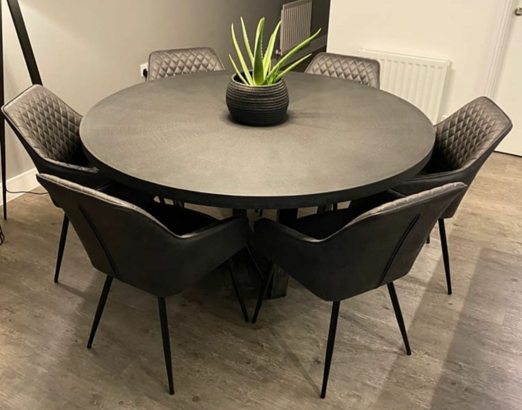
Charcoal and darker graphite tones bring a more sculptural presence. In larger rooms, they can anchor the whole dining area and create real contrast against lighter cabinetry or stone flooring. They tend to suit homes where the table is intended to read as a bold architectural piece. The trade-off is that darker colours create a stronger visual weight, so scale and surrounding light become more important.
Warmer taupe and earthy greige tones sit somewhere between concrete grey and stone-inspired neutrals. These shades work especially well in homes that mix contemporary lines with softer interior detailing. They can take the edge off an industrial aesthetic and make the table feel more integrated with natural materials and warmer palettes.
How to choose concrete dining table colours for your room
The first thing to look at is light. A table placed beneath a roof lantern or in a south-facing kitchen can carry a deeper tone without making the space feel closed in. In a narrower room or one with less natural light, a lighter or mid-tone finish often feels more balanced.
Then consider the visual temperature of the room. If your flooring, cabinetry and walls already lean cool – think white, grey, blue or black – adding another cool concrete shade may create a very crisp, minimal effect. That can look stunning, but it is not always what every home needs. Sometimes a slightly warmer concrete colour introduces enough softness to make the room feel more inviting.
Scale also plays a part. A six-seater table in a modest dining area can take a stronger colour because the overall visual mass is smaller. A ten or twelve-seater statement table in a large open-plan room has much more presence, so the colour needs to be considered with proportion in mind. What looks elegant on a small sample can feel far more dominant once extended across a long table top.
It is worth thinking about what you want the table to do. If the goal is to create a calm, cohesive interior, the best colour may be one that sits close to the wider room palette. If the aim is to make the dining table the star of the space, greater contrast often works better.
Matching concrete colours with interior styles
For modern architectural interiors, mid-grey and charcoal are often the strongest choices. They echo steel, glass and clean-lined cabinetry and give the room a deliberate, design-led feel. Paired with slim leg profiles, these colours can look sharp and contemporary without losing the handmade quality that makes polished concrete special.
For warmer family kitchens, softer greys and greige tones tend to work beautifully. They still deliver the distinctive look of concrete, but with a gentler presence. This is often the sweet spot for clients who want a stunning centre piece that still feels easy to live with every day.
If your home has a more natural, layered interior scheme, lighter concrete shades can be particularly effective. They sit well alongside oak, linen, rattan and brushed metal finishes, creating contrast without harshness. The result is modern, but not cold.
In darker, moodier interiors, deep charcoal concrete can be exceptional. Used well, it creates depth and confidence. The key is to balance it with enough texture and light around the table so the room still feels welcoming rather than severe.
Finish changes colour perception
When people discuss concrete dining table colours, they often focus only on the shade itself. In practice, finish changes how that colour is read.
A smoother, more polished finish tends to reflect more light and can make a tone appear slightly cleaner and more refined. A more matte or softly honed appearance can make the same colour feel more grounded and organic. Edge profile matters too. A crisp contemporary edge can make a dark colour appear sharper, while a softer profile can make it feel more understated.
This is one of the advantages of choosing a specialist maker rather than buying off the shelf. Colour, finish, dimensions and base style all work together. Viewed separately, they are details. Combined properly, they create a table that looks resolved.
Practical considerations that are easy to overlook
A dining table has to work on a Wednesday night as well as when friends come round on a Saturday. So colour should be judged not just by style, but by everyday living.
Mid-tones are often the easiest all-rounders. They are forgiving, practical and consistently attractive across changing light conditions. Very pale colours can look fresh and elegant, though they may show visual contrast from crumbs, spills or everyday clutter more readily. Darker colours can feel luxurious and dramatic, but they may highlight dust or surface marks in brighter daylight.
That does not mean avoiding pale or dark finishes. It simply means choosing them knowingly. A family home with young children may still suit a darker statement table if the room supports it and the owners want that look. Equally, a light concrete table can be completely practical in a busy kitchen when it has been properly sealed and finished. Good design is not about rules. It is about weighing the trade-offs honestly.
Why bespoke colour choice makes the difference
Standard furniture shopping tends to force compromises. The size is nearly right, the shape will do, the colour is close enough. With a concrete dining table, those compromises are often the difference between a table that fills a room and one that truly belongs in it.
Bespoke work allows you to match the colour to the architecture of the house, the amount of daylight, the surrounding materials and the way you actually use the space. It also gives you room to be more confident. If your home needs a long eight or ten seater table with a warmer concrete tone and a particular leg style to tie in with the kitchen, that can be built with purpose rather than guessed from a showroom floor.
At Daniel Polished Concrete, that process is part of the appeal. The colour is not treated as a cosmetic extra. It is one of the core decisions that shapes the finished piece.
The best concrete dining table colours are the ones that still look right when the room changes through the day, when the table is laid for guests and when it is covered in homework, coffee cups and everyday life. Choose with the room in mind, trust the material’s natural character, and your table will feel less like furniture and more like part of the home.